 Well, what would you recommend?
Keep me as the apple of your eye;
hide me in the shadow of your wings
from the wicked who assail me,
from my mortal enemies who surround me.
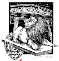
My pastor Eric offered to model for one of my Psalms illustrations/woodblocks, so I took him up on the offer. Just didn't tell him which one he would be modeling for, or my idea.
I was trying for the impression of him being assailed by the "enemies" of life, but being protected by God and being able to "rest" in that protection.
Like my last Psalm, I have decided to keep using paint for the illumination and actual ink for the lettering.
Oh yeah, for my printmaking buds, image was carved in lino and printed on 135lb Zerkal Book weight white paper with Graphic Chemical water based black ink.
Here is the decorative initial: I really wish I could get the colors right on
these scans and have the gold leaf show up correctly.
The colors are right and the intensity is fine,
but it makes the gold look horrible. Oh well.
I like this color combination. It took me some time, and some experimenting, but eventually decided that it worked. Especially when you see below how the illumination turned out (once again, got the idea at church).
 Looks kinda small here, but when you see the final image, it will make sense. It was a longish Psalm, so I had to shorten the image down from my original idea, but I still think it came out O.K.Let me know what you think. Or if you want to purchase any of these, either just a print or the whole thing, let me know.




 Hope you enjoyed!
 Well, what would you recommend?
 Looks kinda small here, but when you see the final image, it will make sense. It was a longish Psalm, so I had to shorten the image down from my original idea, but I still think it came out O.K.


