Friday, September 10, 2010

Psalm 21: Failure and Success

As I sat in the back of the chapel, prior to our Christmas Eve service, I had the pleasure to listen to the beautiful vocalist that would sing that night (Abby Crane, she is awesome!). She was practicing and warming up her vocal chords with, uh, unusual sounds that singers make before singing. And I thought of Psalm 21:

"The king shall joy in thy strength, O Lord; and in thy salvation how greatly shall he rejoice!"

Which of course led me to start sketching out my idea for the image to use. After a few trials and errors, this is the final image:


Now I was off to the races! Next was to use the really cool graphics I had designed for the decorative initial and illumination. But I just wasn't "feeling" it. You can be the judge this time! I am posting my FAIL, and then what I consider, my SUCCESS (well God's actually, it is all His). Here is the first attempt at the decorative initial:

and the first illumination attempt:


And of course, the complete image:

But, as I said, I just wasn't feeling it, something was not right. Or better yet, I didn't like it. I did not feel like it was up to the standards I had set prior to starting this project. I did not want to create anything I was not proud of and was to the full extent of what I could do. And I knew I could do better.

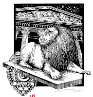
So, following is round 2, starting off with the revised decorative initial:


And the illumination:


And of course the final image:


Feel free to leave your comments!

Now I need to get back to printing and illuminating, Psalm 22 and Psalm 23 are waiting to be printed and Psalm 24 needs to be carved yet.

Thursday, July 15, 2010

Psalm 20

This was one of those Psalms that I could not wait to get to!

Since I have read the Psalms many times, I knew what I thought I wanted to do with this piece for a long time.
I focused in on verse 7:
"Some trust in chariots, and some in horses: but we will remember the name of the LORD our God."
Actually laying it out and designing it though was another matter!
Who would or could have imagined that drawing a tire with a flat would be so hard?

Because I wanted the viewer to see it from a specific angle, I must have drawn and re-drawn that tire a million times. Still it didn't look the way I wanted it to

Then I had an idea (I know, a rarity for me).
I asked a friend of mine who's daughter had a Mercedes if he could help me out. Luckily he was into the idea.
So, without his daughter knowing about it, we snatched her car in the early morning light!
Drove it up to a nearby gas station, and let all the air out of the tire onto a small Styrofoam ring I had purchased.
Took a bunch of pictures from a bunch of angles, re-inflated the tire and snuck the car back home.
She never knew!

Then of course when the print was done I showed it to her. "I have a car just like that!".
I know.
Hahahahaha.
So, here is the print (and yes, I noticed that boo boo in the spoke, it is now fixed for any future prints):

One of the things you may not notice right off the bat is that I got just a little crazy with the cross-hatching. I wanted to see how small and intricate I could get, kinda like a personal challenge. Here are some close ups of the final printed image:


Here is the decorative capital:
And the Illumination:

I felt like I needed to have this design encompass more than just the bottom, it was so strong of an image.
And the final print!

Saturday, July 10, 2010

The Saga of Psalm 19

Where do I start?
Probably one of the most difficult Psalms for me to illustrate, it literally took me weeks to conceive, create, recreate, revise, redraw, and finally get happy. Then I made the mistake of asking others what they thought of the design! So, more drawing, designing, etc.....

This was the final design below I decided to go with,but as you can see, many areas were totally undecided.

Then came the decision, how do I carve this dreamscape?

I think I wound up redrawing the lines about5 times before I even came close to figuring out
how I wanted to carve.(I always attempt to draw my images in pen as I
plan carve them in wood).

Here is the idea and final image side by side:

On to the illumination!

I really had fun with the designing of this motif! I will just go ahead and show you the designs of the decorative initial and illumination and let you decide if it works:


And here is the final image:As always, comments are appreciated and they let me know someone is actually looking at this stuff.

Sunday, June 20, 2010

A Review So Far

I realized recently that some of the nice people I meet and send here either don't know or realize that my prints are organized by dates. So, I thought it would be nice and the right time to do a review.

So, here they are so far, Psalm 1 through Psalm 18.
Click on any image and it will take you to the full post for details and the full Illuminated Psalm.


So this is it so far..............

Please leave your comments!

Stay tuned, updates coming soon.

Thursday, March 11, 2010

Psalm 18


By far, one of the easiest images to create and one of the hardest to illuminate!

This is also one of my favorite images I have created. The verses virtually sang to me the imagery. I wanted to depict God saving me from the "pit" and the "cords" that attempt to hold me down.

I am not totally satisfied with the cross-hatching, maybe at some later date I will go back and thin out more lines to help with the shading, or maybe I will leave it be, because the arm is being rescued from below where it is not all smooth and nice.

Again, printed with Graphic Chemical black on Zerkal book vellum
(which I found out is hand made in Germany). Carved in lino, mainly with an exacto knife (although my U gauge and V gauge are getting lonely.

The decorative initial was easy enough:

Once again going retro, I decided to do everything
in India ink and brown ink. I didn't add any other
colors because I was very satisfied with the way
the image looked as is.

Also, I had in the back of mind what the final
product would look like once the illumination
was completed. The main problem was yet to
come; how was I going to fit all the text
on one piece of paper?

After much consideration, and 5 trial runs of writing the Psalm out, in calligraphy form, I decided that unless people were going to look at this with a magnifying glass, it would never all fit on one piece of paper.

Rather than prattle on, here are the final illumination
s:


Page 1


Page 2


And the final images:
Hope you enjoyed!


Sunday, February 28, 2010

Psalm 17

Well, what would you recommend?

Keep me as the apple of your eye;
hide me in the shadow of your wings

from the wicked who assail me,
from my mortal enemies who surround me.

My pastor Eric offered to model for one of my Psalms illustrations/woodblocks, so I took him up on the offer. Just didn't tell him which one he would be modeling for, or my idea.

I was trying for the impression of him being assailed by the "enemies" of life, but being protected by God and being able to "rest" in that protection.


Like my last Psalm, I have decided to keep using paint for the illumination and actual ink for the lettering.

Oh yeah, for my printmaking buds, image was carved in lino and printed on 135lb Zerkal Book weight white paper with Graphic Chemical water based black ink.

Here is the decorative initial:


I really wish I could get the colors right on
these
scans and have the gold leaf show up correctly.

The colors are right and the intensity is fine,
but it makes the gold look horrible. Oh well.


I like this color combination. It took me some time, and some experimenting, but eventually decided that it worked. Especially when you see below how the illumination turned out (once again, got the idea at church).

Looks kinda small here, but when you see the final image, it will make sense. It was a longish Psalm, so I had to shorten the image down from my original idea, but I still think it came out O.K.

Let me know what you think. Or if you want to purchase any of these, either just a print or the whole thing, let me know.


Saturday, February 20, 2010

Psalm 16

The journey continues......

I am still designing, carving, printing and illuminating the series, just slow in updating! I have carved up to Psalm 20, printed and illuminated up to Psalm 18 and Psalm 21 is all designed and ready for the block.

"Keep me safe, O God, for in you I take refuge". Psalm 16:1

Well, here is the printed image for Psalm 16.

The model is my lovely daughter Meagan.

I was trying to capture an image of fear, loneliness, confusion and overall angst. David supposedly wrote this Psalm while hiding in a cave from Saul. A modern interpretation would have someone hiding in a room. In the corner. In the darkness.

Image was carved on a wood block (maple). Had fun with the background, which was created with different grits of sandpaper, a roller, a hammer and a pig sticker.

I didn't want to shade or shadow Meagan, I liked the look that just over-exposing the image created, it added to the "feeling" I was shooting for.

Used Graphic Chemical water based black ink, printed on the Zerkal I have been using for all the images. I keep telling myself to stop designing with soooo much black space areas (they are very hard to print correctly and very tiring). But I digress.

Now for some new fun! I decided to change from markers for the calligraphy and illumination and go a little more analog. Here is the decorative initial:

By the way, big props for my local Kinko's, who helped me with the scanning. They are so good and very nice.

I designed the decorative letter myself, as I have done for almost all of these Psalms. Don't tell my pastor, but I designed this one Sunday morning during church. I get some of my best ideas in church.

I used tempra paint and watercolors for the initial, and a very, very small brush, as well as black ink from the bottle for the outlines. I also switched from a marker for the calligraphy to a metal tipped calligraphy pen, which I really like. You can see below how much more crisp and precise the lettering looks and it also allows me to be a bit more flourishing.

Here is the illumination:

It stretches across the whole page, encompassing both the print and the text. Hand painted as well.

And here is the final image:

Comments are always welcome and appreciated. Sales too.