I took a very long time on this Psalm, for many reasons. I figured this would be the one most people
look for first (Google), the most recognizable, the most "universal", the most comforting, the most everything that everyone loves about the Psalms.
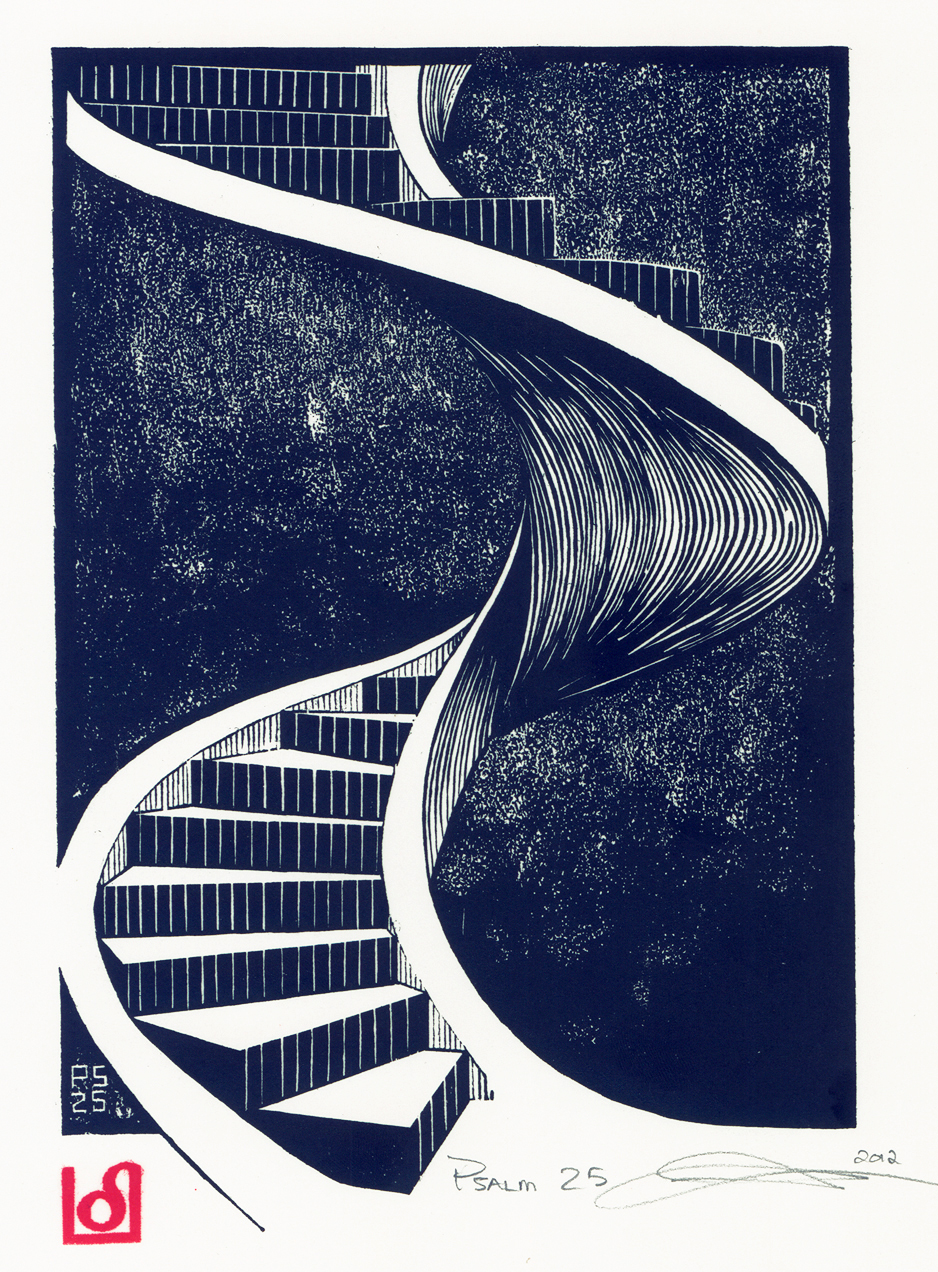
I spent a very long time in contemplation also, which verse or verses to illustrate? I had many ideas, many images (someday I may come back to this Psalm again and illustrate those many different versions). But for now, I like the resulting image I have done.
" He maketh me to lie down in green pastures: he leadeth me beside the still waters."
I also went ahead and tried a technique I had not used before, more of a stippling or pecking motion with the carving tool. The image is 6.25" x 8", carved on standard lino block.
I used as my model a young man I know and positioned him at the angle that my minds eye "saw". Can't say exactly why, It just "worked".
The most difficult task in the image was the mental gymnastics, for me at least, of working from a dark to light rather than the other way around. Those of you who are printmakers will understand, those of you who are not, well, here goes: in relief printing, everything is reversed. When carving a line or circle, it is usually easy. When carving out of a field of black already, it gets a little trickier. At least for me it was!
Then of course the next "problem" became: what in the world am I going to use for the decorative initial and illumination? If this is the print they have been waiting for (I know, a little pompous, but hey), then I need to make the illumination just as good, maybe even better.
So, I decided to design something classical and classy, but still had a little flair to it.
Funny thing is, the more I try and make these designs interesting and full of "flair", the harder and harder they get to draw and paint!
Somehow they look much easier when I design them at 500% of the finished size, totally forgetting
that I now need to reduce them down to be decoration and not the artwork itself.
But try painting some of these things! I am down to a brush with like one hair in it!
So, after much complaining and whining, here is the illumination:
Now you are only seeing it at this size, you should see this baby in real life. It is small and intricate, but God helped me to make it nice for His glory.
Here is the final image, but first, I also had to cut a new chop mark because my old one was looking so crummy!
So, there it is. Love it or hate it, that is up to you. But please, if you like, leave a comment. It does my ego good to see people post on here. Also, I have decided to make these for sale.
$75.00 for the printed image only
$100.00 for a framed one of the image only.
$499.00 for a "full" illuminated and calligraphic image, unframed
Let me know!
 I found the graphic in an old book, then modified it to fit my design.


