Tuesday, May 28, 2013

Psalm 29

How long should an artist pursue an idea? a dream? a vision?  

The "idea/image" came to me in a flash of inspiration, but getting that image on the block was going to be quite a journey.
  
I knew that I wanted to pay homage to Hokusai's great print, but how?  Lino seemed way too cold and a rectangular woodblock just wasn't exciting me, until I helped a neighbor cut down a tree and saw him slice off a chunk.

 Aha, that was it!  

I then set off on a journey to find the perfectly shaped stump that would inspired me and do honor to the image.  After a few hours of searching and a long explanation to the guy selling fire wood that I only wanted a "slice" of a log, I had three perfect slices.

But then I quickly realized two things: one was that these slices were not of an even and consistent thickness, and two was that they were far from dried wood.

First, let's get my favorite stump slice dried!  So I left it in my hot car all day long.  Uh oh, it's cracking, what to do?  The it dawned on me, this fits right into the Psalm even better;
The voice of the Lord breaketh the cedars; 
yea, the Lord breaketh the cedars of Lebanon.
 I could make this work I was thinking, now to get the thing leveled.

Sweet Jesus, it's cracking even more!  OK, I can still make this work.  I think.  It took me a total of two weeks to finally get this block level, sanded and to stop it from splitting apart any more.  BTW, it usually takes me less than an hour to prep a block.

Oh, and I almost forgot to mention, the image I wanted to carve wasn't working on the first stump slice, it was splitting in an awkward way.  So I had to start all over again with one of the other slices.

 So, here is the image drawn on the block, prior to carving.
And, the finished carved piece (which still was not perfectly leveled, but good enough to work with).

OK, now many months later, I am finally ready to print!  The final printed image almost made me weep, I was so happy that it came out like it did.

Printed with Graphic Chemical black water based ink on a sheet of 15" x 22" Zerkal Book off white 145gpm paper.

Getting the ink to distribute evenly on a warped block was a nightmare, so I glued the block to a piece of 3/4" plywood and weighted the sucker down for a week.

And printed again.

Here are a few random pictures of the illumination process:


 And here is the final, full size illuminated manuscript:

Quite simply, this image is a gift from God, in it's totality, truly a gift.

Please leave a comment below.


.

Monday, May 13, 2013

Psalm 28

2 " Hear my cry for mercy as I call to you for help,"

In my mind, whenever I consider what is going on in the world today, I imagine the events as swirling, angry and invasive "winds".  When I consider my safety or harbor, I see the cross.  But many times, too many times, those winds try to invade my harbor, my safety.

But the cross remains: sturdy, strong and never bending or breaking.

I tried out so many ideas and techniques on this print and wood block that I felt like it was an experiment.  But the final image, when printed, came out so cool and so detailed that I kept it as a final, completed Psalm.

I used cherry wood for the block, finely sanded and prepared.  Still using mainly an ex-acto knife, my only other tool was a very sharp and very lethal tungsten needle.  I started off merely marking the lines with the steel needle very lightly, then decided to go back over the lines multiple times, going deeper with each "scratch" until the void was deep enough for printing.


For all my printmaking buddies, the paper was Zerkal 145 lb. off -white book, cut in half for a paper size of 18" x 30".  Block was printed with Graphic Chemical water soluble black ink using the Western method of a brayer and dry paper.  I do not use a press for the impression, just good old school muscles with a wooden spoon and glass of whiskey.


The decorative initial and color choices for the illumination were inspired by the image.  I used just plain old water based paints from Michaels Crafts and a very teeny tiny paintbrush.

I wish you could see the original images, the gold never scans correctly, but looks awesome!
Here is the final image in all it's glory.  Let me know what you think.

Monday, April 29, 2013

Psalm 27

I have been doing this blog for years now, but is anybody reading it?  I keep thinking of the lyrics to a song, "Is there anybody out there?  Does anyone care?".  So, if you do read this, leave a comment below, please.

 One of the things that annoyed me in my college education and subsequent readings over the years has been the "opinions" of historians and critics on the "meaning" behind paintings and drawings.  How did they really "know" what the artist meant, or was getting at, or what inspired them?  It was all a guess, maybe an intellectual one, maybe not, but it is still a guess. 

So, that being said, this time I would like to focus mainly on the image and TELL you my motive, inspiration, meaning, etc.....

I must have read this psalm over and over again twenty times before it hit me, this image is not going to be about a specific verse or group of verses, but about the ":feeling" I get when I read the whole psalm: safe.

So, what says safe?  After considering many ideas and images, I finally settled on the image you now see, a cleat.  Once that idea took shape, the rest came along easily.  The rope represents ourselves and our lives; twisted, rough, non-uniform, strong and rotting at the same time.  But wrapped around the cleat?  Security, safety, tied, etc.....

As you may have noticed, I like to represent God, or the idea of God, as pure white.

Technical details: lino block, Zerkall Book 145gm, Graphic Chemical Black w/s ink.

Peace out.  If enough people comment, I will come back and explain the decorative initial and illumination. 


Monday, April 1, 2013

Psalm 26

This is one of my most exciting Psalm's to date.  I stretched myself visually and artistically, creating an image I had no idea if I could even carve, let alone print.

There were so many parts of this Psalm I could have focused on, or the Psalm as a whole could have been envisioned and drawn.  But I decided on a verse, and an image, that was a little more obscure.

4 " I have not sat with vain persons, neither will I go in with dissemblers."

Per my favorite, Merriam-Webster online dictionary,
1: to hide under a false appearance
2: to put on the appearance of : simulate
intransitive verb
: to put on a false appearance : conceal facts, intentions, or feelings under some pretense 

And the shoes, ah the shoes!  In very many countries, cultures and backgrounds, putting shoes on top of something, even throwing shoes, is meant as a sign of disdain and disgust.  So, I decided to place a pair of shoes on top of a selection of books, that in my opinion, propagate dissembling.


 Here is a close up of the print itself.  This was created on linoleum, the total image size being 6.25" x 8", and carved almost exclusively with an x-acto knife.  

My goal, how thin can I carve and print?  The lines came out nicely and I used Graphic Chemical water based black ink for the printing.  But, in my opinion, the linoleum has too much give to create a line as "tight" as I would like, but it still came out quite nicely.


The decorative initial and illumination are also something new for me.  I decided to go with silver rather than gold, and I also decided to go with colored ink rather than paint.  I also decided to go back to just straight calligraphy, without much embellishment.


And here is the final, complete image!  

Sunday, March 24, 2013

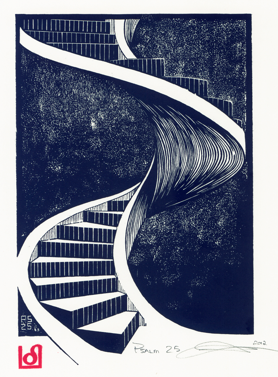
Psalm 25

It has been far too long, I know.  But I had the visions and desire to design, carve and print more than illuminate, so that is exactly what I did.  Currently I have carved up to Psalm 34 and printed up to Psalm 31.  Now back to some illuminating!
Following is Psalm 25, a joy to design and carve (on cherry wood). Unlike some of my illustrations, this one is not as direct and simple.

I experimented with background using different grades of sandpaper (although at times I will admit to being a little too heavy with the hammer).  I started with 160 grade and worked my way up to 220 grade.  I was intent on making the upper portion brighten than the lower, as if the climb were into heaven itself, but not all the way mind you.

The verse that touched my heart was "Show me your ways, Lord, teach me your paths."

Since the road of life seems to never be straight or easy,  I instantly envisioned a staircase, not an easy gently sloping one, but a twisty, turning and straight up staircase.  

The Decorative Initial first.
I found the graphic in an old book, then modified it to fit my design.

The colors did not transport over as well as I would like, the red is deeper and the blue not so,
blue.

A careful eye will notice a slight mistake I made 
in the calligraphy, but I won't point it out for you.


The illumination was a blast, difficult to paint but fun to design!

 
And the full image, enjoy and comment please!


Sunday, April 22, 2012

Psalm 24

Where to begin?  Hmm, how about with the technical stuff?  OK.
Woodblock was pine, paper was Zerkal and ink was Graphic Chemical water based black.

The image was inspired by
verse 7:

"Lift up your heads, O ye gates; and be ye lift up, ye everlasting doors; and the King of Glory shall come in"  KJV

I also love trying to depict wood and other unique surfaces, so I went with this old wooden door, brass nameplate, cast iron knocker and security keypad image.  I had fun with the door knocker, trying to incorporate the world and open hands into the image.


Here is the illuminated border and capital initial, bot hand painted (btw, each one of the border blocks are around 1.5" x 2").
I know it might look white here, but the vines are actually a light cream color, which was very, very hard to paint!

Next I decided to change the calligraphy a bit, still not perfect but I like the way it looks.  I dropped the numbers and instead started each verse with a capital letter, a semi illuminated capital initial per se.  Here is the final result:
So, here is the final completed image:

Friday, May 20, 2011

Psalm 23

I took a very long time on this Psalm, for many reasons. I figured this would be the one most people
look for first (Google), the most recognizable, the most "universal", the most comforting, the most everything that everyone loves about the Psalms.

I spent a very long time in contemplation also, which verse or verses to illustrate? I had many ideas, many images (someday I may come back to this Psalm again and illustrate those many different versions). But for now, I like the resulting image I have done.

" He maketh me to lie down in green pastures: he leadeth me beside the still waters."

I also went ahead and tried a technique I had not used before, more of a stippling or pecking motion with the carving tool. The image is 6.25" x 8", carved on standard lino block.

I used as my model a young man I know and positioned him at the angle that my minds eye "saw". Can't say exactly why, It just "worked".

The most difficult task in the image was the mental gymnastics, for me at least, of working from a dark to light rather than the other way around. Those of you who are printmakers will understand, those of you who are not, well, here goes: in relief printing, everything is reversed. When carving a line or circle, it is usually easy. When carving out of a field of black already, it gets a little trickier. At least for me it was!

Then of course the next "problem" became: what in the world am I going to use for the decorative initial and illumination? If this is the print they have been waiting for (I know, a little pompous, but hey), then I need to make the illumination just as good, maybe even better.


So, I decided to design something classical and classy, but still had a little flair to it.


Funny thing is, the more I try and make these designs interesting and full of "flair", the harder and harder they get to draw and paint!

Somehow they look much easier when I design them at 500% of the finished size, totally forgetting
that I now need to reduce them down to be decoration and not the artwork itself.

But try painting some of these things!  I am down to a brush with like one hair in it!

So, after much complaining and whining, here is the illumination:
Now you are only seeing it at this size, you should see this baby in real life. It is small and intricate, but God helped me to make it nice for His glory.

Here is the final image, but first, I also had to cut a new chop mark because my old one was looking so crummy!
So, there it is. Love it or hate it, that is up to you. But please, if you like, leave a comment. It does my ego good to see people post on here. Also, I have decided to make these for sale.

$75.00 for the printed image only
$100.00 for a framed one of the image only.
$499.00 for a "full" illuminated and calligraphic image, unframed

Let me know!

Friday, March 4, 2011

Psalm 22


Seems like it has been forever. But the day is finally here. A new post!

Here is the latest in the series, possibly one of my most passionate and powerful.

You be the judge:

When I started think of the image to use for this Psalm, I was tossed: to do an image of Christ or an image of a mystery man? Or both?

So, I settled on a self-portrait of myself. I also changed up my style a little, looking to portray a more emotional image than a pictorial image.

I cannot tell you the amount of times or times I have
felt this way, I do not have enough fingers or toes to count. Too many nights have been spent anguishing over Hannah, the economy, my life and so many other issues.

I used pine wood for the block. Just the plain old cheap stuff from my neighborhood Home Depot.
Paper is the same Zerkal and ink my faithful Graphic Chemical WS Black, which is no longer available and I am out of!


Oh well.

Nothing too special about the decorative initial or illumination, other than trying to make them fit together with this extra long Psalm.


For those who like whimsy and those who pay close attention to detail, here is a correction buried in the calligraphy:
And finally, here is the completed piece:
By the way, I decided to also start using smaller decorative caps when separating verses, which can be seen on the enlargement.

Hope you enjoy, leave a comment or two!

Friday, September 10, 2010

Psalm 21: Failure and Success

As I sat in the back of the chapel, prior to our Christmas Eve service, I had the pleasure to listen to the beautiful vocalist that would sing that night (Abby Crane, she is awesome!). She was practicing and warming up her vocal chords with, uh, unusual sounds that singers make before singing. And I thought of Psalm 21:

"The king shall joy in thy strength, O Lord; and in thy salvation how greatly shall he rejoice!"

Which of course led me to start sketching out my idea for the image to use. After a few trials and errors, this is the final image:


Now I was off to the races! Next was to use the really cool graphics I had designed for the decorative initial and illumination. But I just wasn't "feeling" it. You can be the judge this time! I am posting my FAIL, and then what I consider, my SUCCESS (well God's actually, it is all His). Here is the first attempt at the decorative initial:

and the first illumination attempt:


And of course, the complete image:

But, as I said, I just wasn't feeling it, something was not right. Or better yet, I didn't like it. I did not feel like it was up to the standards I had set prior to starting this project. I did not want to create anything I was not proud of and was to the full extent of what I could do. And I knew I could do better.

So, following is round 2, starting off with the revised decorative initial:


And the illumination:


And of course the final image:


Feel free to leave your comments!

Now I need to get back to printing and illuminating, Psalm 22 and Psalm 23 are waiting to be printed and Psalm 24 needs to be carved yet.